![]()
The Price is Left
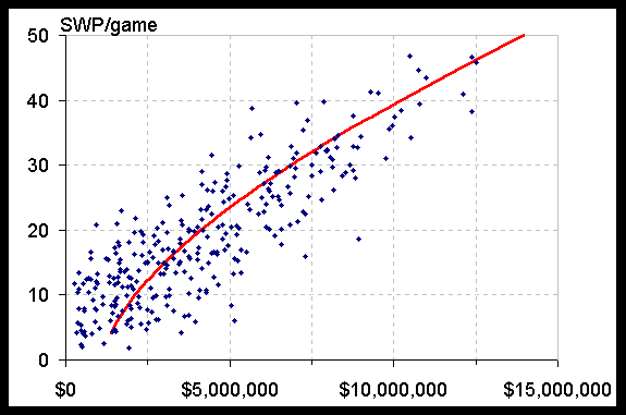
Each point on the graph represents one player. Price is plotted along the x-axis, and SWP's per game is plotted along the y-axis. For this graph, I like to use the average SWP's per game for the last 10 games. The red line represents the best fit line. (For those with a desire to know, I fitted a cubic equation, and minimized the squares of the price errors, where price was a function of SWP/game.)
In general, players represented by points above and to the left of the line are better value than those below and to the right. Of course, there are some exceptions - in particular when injuries are a factor.
Return to
The Price is LeftHoop Pointers is written by Dave Hall (a.k.a. the Guru), an avid fantasy sports player. He is not an employee of any of the fantasy games discussed within this site, and any opinions expressed are solely his own. Questions or comments are welcome, and should be emailed to
Guru<davehall@home.com>.